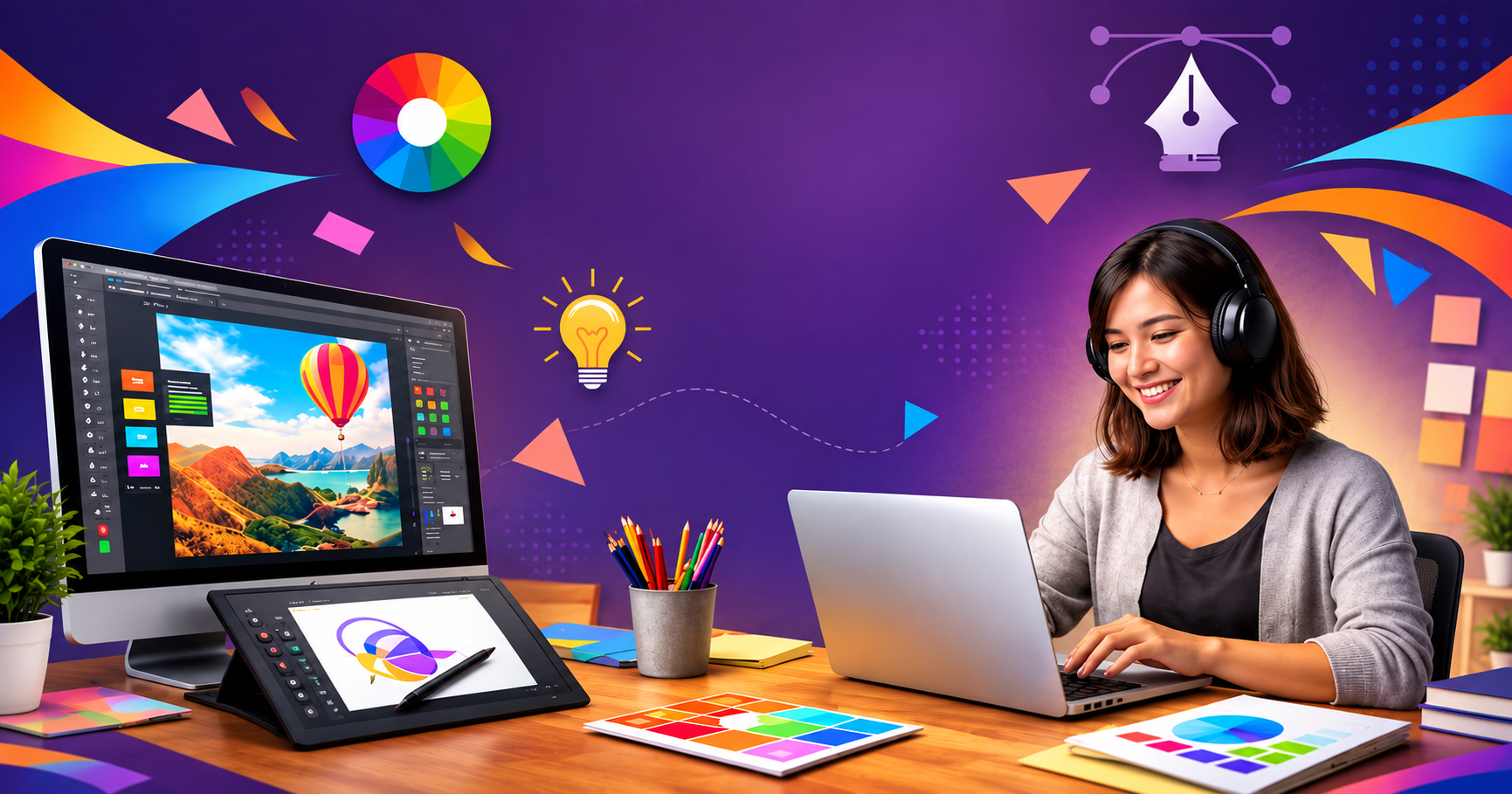
Graphic design is everywhere — on the packet of chips you picked up this morning, the app icon you tapped before reading this, and the billboard you passed on your way to work. Behind every one of these visuals lies a set of foundational building blocks that designers rely on, whether they’re crafting a logo, a poster, or a full brand identity. These building blocks are known as the elements of graphic design, and understanding them is the first real step toward thinking and working like a professional designer.
If you’ve ever wondered how designers turn a blank canvas into something that grabs attention, communicates a message, and looks polished at the same time, the answer lies in how skillfully they combine these seven core elements. In fact, mastering these fundamentals is exactly what a good graphic design course focuses on before moving into advanced software and specialised techniques.
In this blog, we’ll break down each of the seven elements, explain why they matter, and show how they work together to create effective visual communication.
Why Understanding These Elements Matters
Before jumping into the list, it’s worth understanding why these elements are so important. Graphic design isn’t just about making something “look nice.” It’s a form of visual communication meant to inform, persuade, or evoke emotion. Every element a designer chooses — a color, a font, a shape — carries meaning and influences how the viewer perceives the message.
Beginners often jump straight into software like Photoshop or Illustrator without understanding these fundamentals, which usually results in designs that feel inconsistent or amateur. That’s why structured learning matters. A well-designed graphic design course will always start with these basics, because once you understand them, everything else — layout, branding, digital art — becomes far easier to grasp.
The 7 Elements Of Graphic Design
1. Line
A line is the simplest yet most powerful element in design. It’s essentially a point moving in space, and it can be straight, curved, thick, thin, dotted, or jagged. Lines are used to divide space, create structure, lead the viewer’s eye, or add emphasis to a particular section of a design.
Think about how a simple horizontal line under a heading separates content, or how curved lines in a logo can suggest movement and flow. Lines also help establish hierarchy — bold lines draw attention, while thin lines feel subtle and refined.
2. Shape
Shapes are formed when lines connect or enclose a space. They can be geometric (circles, squares, triangles) or organic (freeform, irregular shapes found in nature). Shapes are the building blocks of icons, logos, and layouts.
Different shapes evoke different emotions. Circles often feel friendly and unified, squares suggest stability and trust, while triangles can create a sense of energy or direction. Designers choose shapes carefully depending on the brand personality they want to convey.
3. Color
Color is arguably the most emotionally powerful element in design. It sets the mood, grabs attention, and often determines whether a viewer feels drawn to or repelled by a design. Colors also carry cultural and psychological meaning — red can signal urgency or passion, blue often conveys trust and calmness, and yellow tends to feel optimistic and energetic.
A skilled designer understands color theory: complementary colors, contrast, color harmony, and how colors behave differently across digital screens versus print. This is one of the most detailed topics covered in any serious graphic design course, since incorrect color choices can completely change how a brand is perceived.
4. Texture
Texture refers to the surface quality of a design — whether it looks smooth, rough, glossy, or grainy. In physical design (like packaging or print), texture can be tactile and literally felt. In digital design, texture is simulated visually through patterns, gradients, shadows, or digital effects to add depth and realism.
Texture helps designs feel less flat and more dynamic. A well-placed textured background, for instance, can make a poster feel more premium or vintage, depending on the style chosen.
5. Typography
Typography is the art of arranging text in a way that’s both readable and visually appealing. It includes choices around font style, size, spacing, alignment, and weight. Typography isn’t just about picking a “nice-looking” font — it’s about matching the tone of the message with the right typeface.
A bold, blocky font might work for a fitness brand aiming for strength and energy, while a delicate script font suits a wedding invitation or a luxury cosmetics brand. Typography also affects readability, which is critical in web design, advertising, and branding materials.
6. Space (Whitespace)
Space, often called whitespace or negative space, refers to the empty areas within a design. While it might seem like “nothing,” space is actually one of the most strategic tools a designer has. It helps prevent visual clutter, improves readability, and draws attention to the most important elements on the page.
Minimalist designs, in particular, rely heavily on the smart use of space to create a clean, sophisticated look. Poor use of space, on the other hand, can make even a well-thought-out design feel cramped and overwhelming.
7. Form
Form refers to the three-dimensional quality of an object within a design — giving it depth, volume, and a sense of realism. This is achieved through shading, gradients, highlights, and perspective. While shape is two-dimensional, form gives objects a sense of weight and dimension, making them appear more lifelike.
Form is especially important in product design, 3D illustrations, packaging mockups, and UI elements like buttons that need to appear “clickable.”
How These Elements Work Together
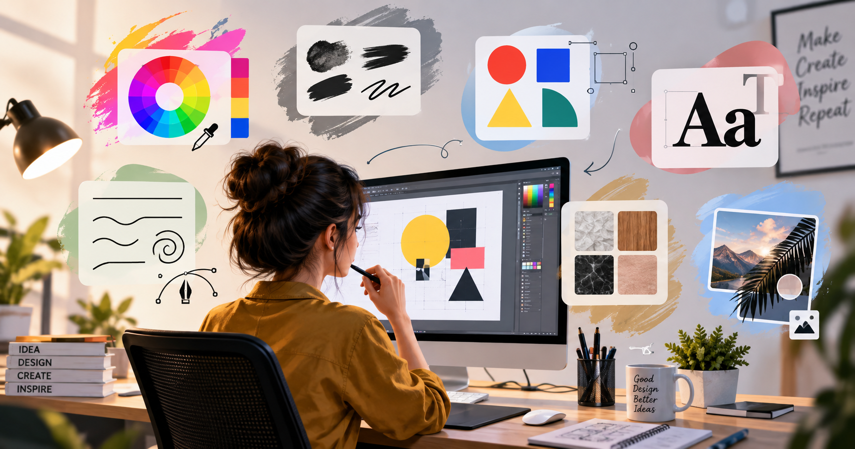
None of these elements work in isolation. A great design is the result of combining line, shape, color, texture, typography, space, and form in a way that feels balanced and intentional. For example, a poster might use bold typography (typography) placed within generous whitespace (space), accented with a vibrant color palette (color) and simple geometric shapes (shape) to create visual interest.
This is exactly the kind of practical, hands-on skill that students develop while enrolled in a structured graphic design course, where theory is paired with real projects — logos, posters, social media creatives, and branding kits — to build a strong portfolio.
Why Learn Graphic Design Professionally?
While it’s entirely possible to pick up bits of design knowledge through YouTube tutorials and online articles, professional training offers structured learning, mentorship, and hands-on project experience that’s hard to replicate on your own. A good course doesn’t just teach software; it builds your visual thinking from the ground up, starting with these seven elements and moving on to composition, branding, and industry tools like Adobe Photoshop, Illustrator, and InDesign.
For students and working professionals based in eastern India, enrolling in a graphic design course in Kolkata can be a great way to learn from experienced trainers, work on live projects, and build a portfolio that stands out to employers or freelance clients. Kolkata, with its growing creative and advertising industry, offers plenty of opportunities for skilled graphic designers to find work in agencies, media houses, and startups.
Whether you’re a complete beginner or someone looking to upskill, learning these fundamentals through a proper graphic design course in Kolkata gives you a strong local support system, practical exposure, and networking opportunities within the region’s creative community.
Conclusion
Graphic design might look like pure creativity from the outside, but at its core, it’s built on a solid foundation of seven essential elements: line, shape, color, texture, typography, space, and form. Understanding how each of these works — and more importantly, how they interact with one another — is what separates amateur designs from professional, polished work.
If you’re serious about building a career in this field, investing time in a structured graphic design course is one of the smartest steps you can take. And if you’re based in or around West Bengal, exploring a graphic design course in Kolkata can give you the added benefit of local mentorship, industry connections, and hands-on training tailored to the regional creative market. With the right foundation in these seven elements, you’ll be well on your way to creating designs that don’t just look good, but actually communicate effectively.
Explore More Blog: Best Graphic Design Course for Beginners
FAQs
1. What are the 7 elements of graphic design?
The seven elements are line, shape, color, texture, typography, space, and form. Together, they form the foundation of every visual design, from logos to full branding systems.
2. Which element of graphic design is the most important?
There isn’t a single “most important” element — they all work together. However, color and typography are often considered the most impactful because they directly influence emotion and readability.
3. Do I need to learn all 7 elements before using design software?
Yes, ideally. Understanding these elements first helps you make intentional design choices rather than relying on trial and error inside software like Photoshop or Illustrator.
4. How long does it take to learn graphic design?
It depends on the depth of learning, but most structured programs take anywhere from a few months to a year to cover fundamentals, software tools, and portfolio-building projects.
5. Is it worth joining a graphic design course instead of learning for free online?
While free resources are helpful, a proper graphic design course offers a structured curriculum, expert feedback, mentorship, and real project experience — all of which speed up your learning significantly.

Pooja Sharma is a creative education content writer who creates engaging articles on career guidance, skill development, and learning opportunities to help students make informed decisions.